D’Addario Brand Refresh
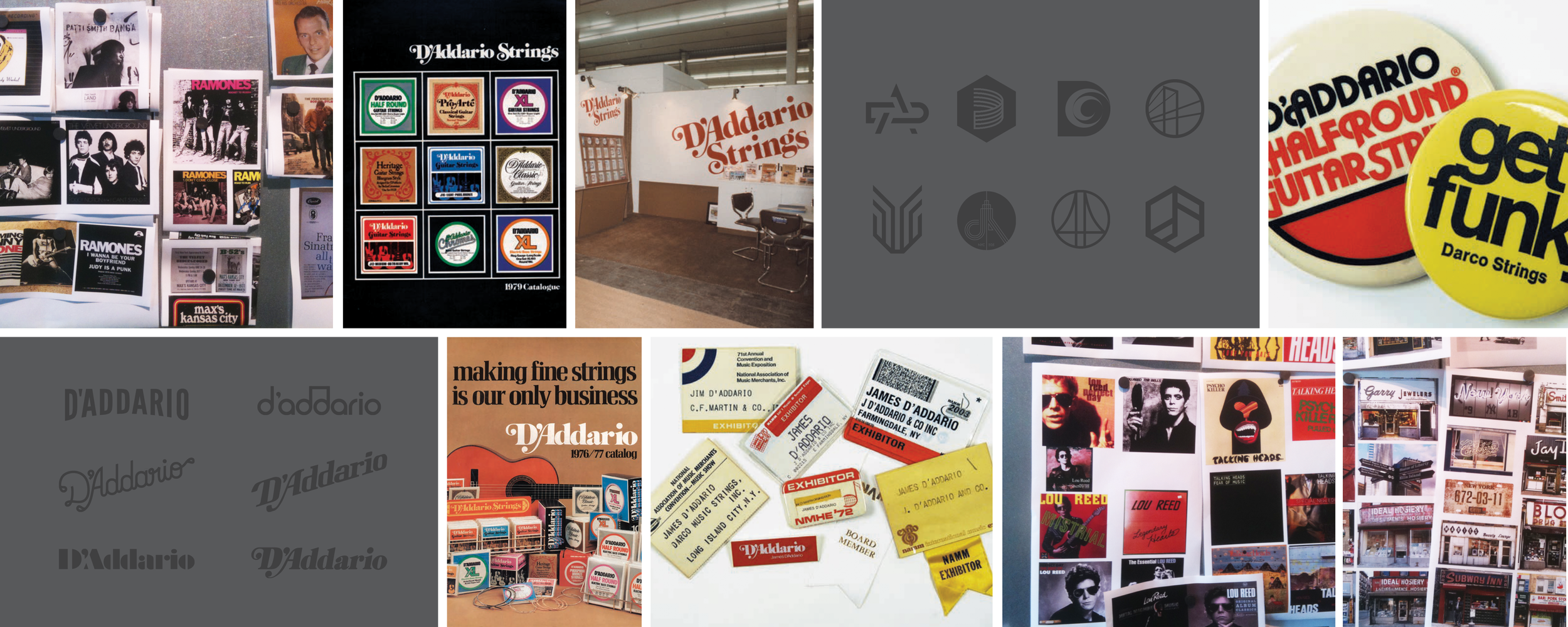
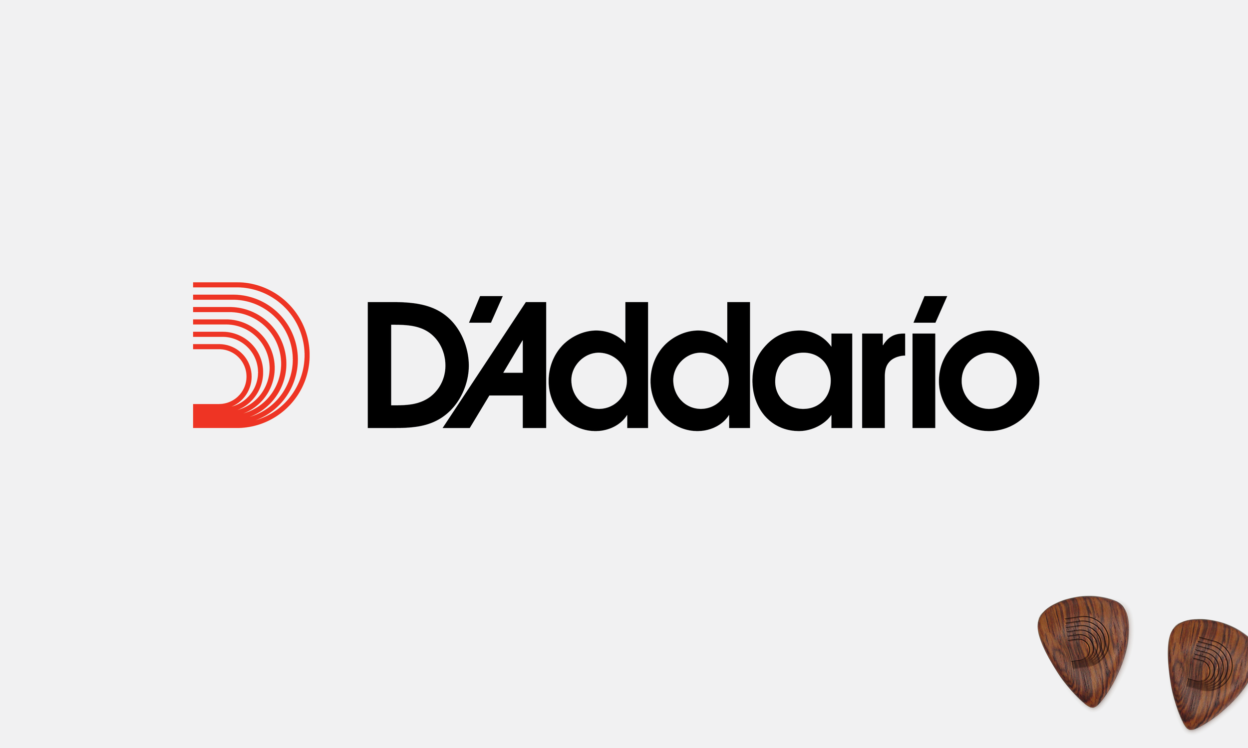
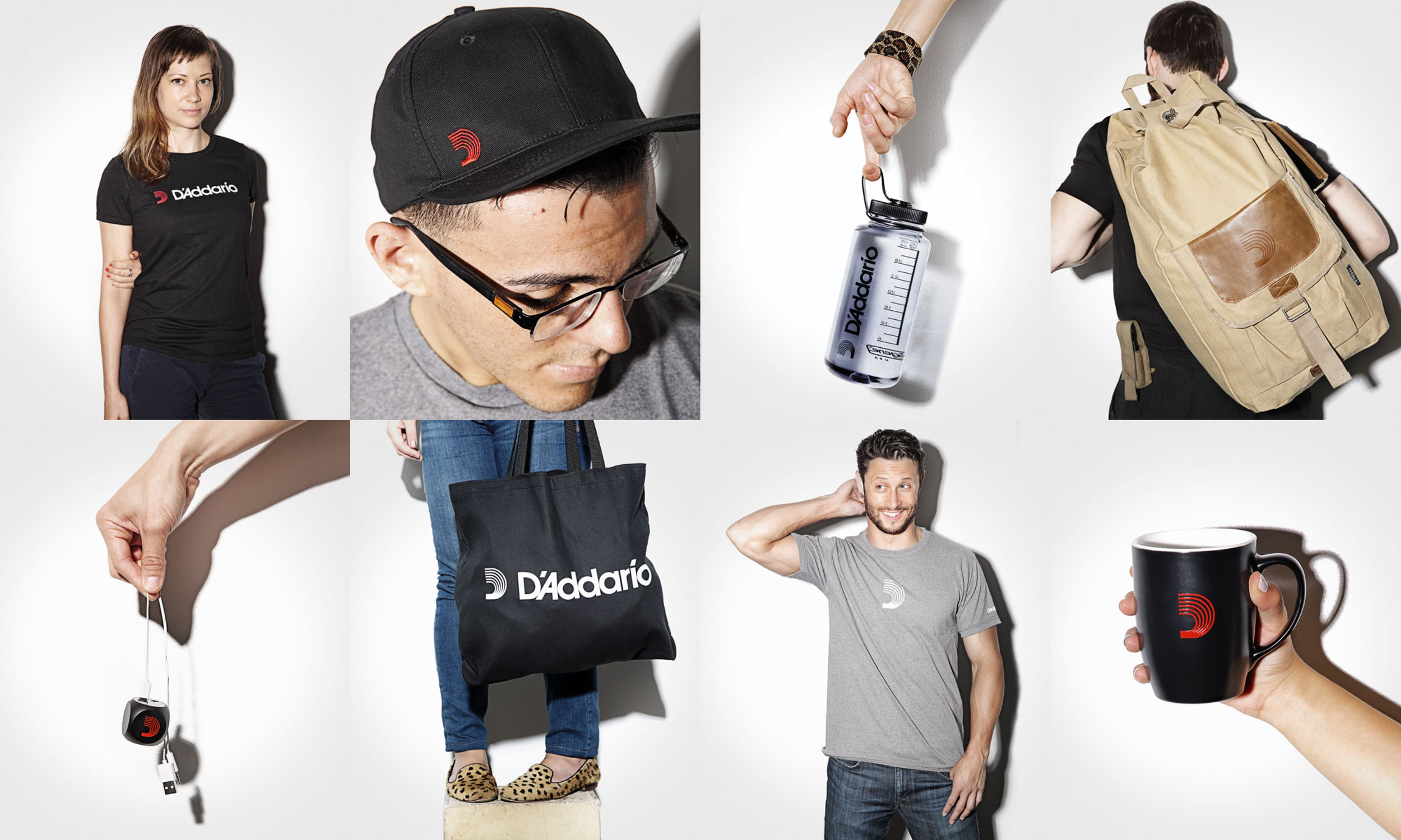
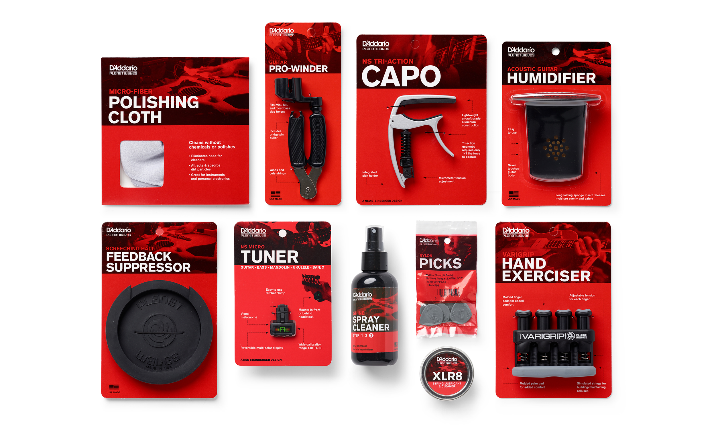
D’Addario’s new logo evolved out of a brand summit and a need to bring all six businesses under one umbrella brand. As a stamp of quality and familiarity needed for a massive number of products and a diverse range of music types, the versatile nature required of the logo meant it needed a timeless look.
With a classic typeface and a monogram rooted in six-string guitars — as well as the company’s six businesses joining to form one — the redesign of the logo also had a positive, unintended effect on the CEO: “The most important lesson we learned from the process was that we were running six brands in all different ways,” said Jim D’Addario. “There was no uniform brand purpose and we weren’t getting or taking credit for the many great things the company has done and continues to do.”
Credits
Agency: VSA Partners
ECD: Thom Wolfe
Senior Strategist: Jonathan Turitz